THE ELEVATOR PITCH
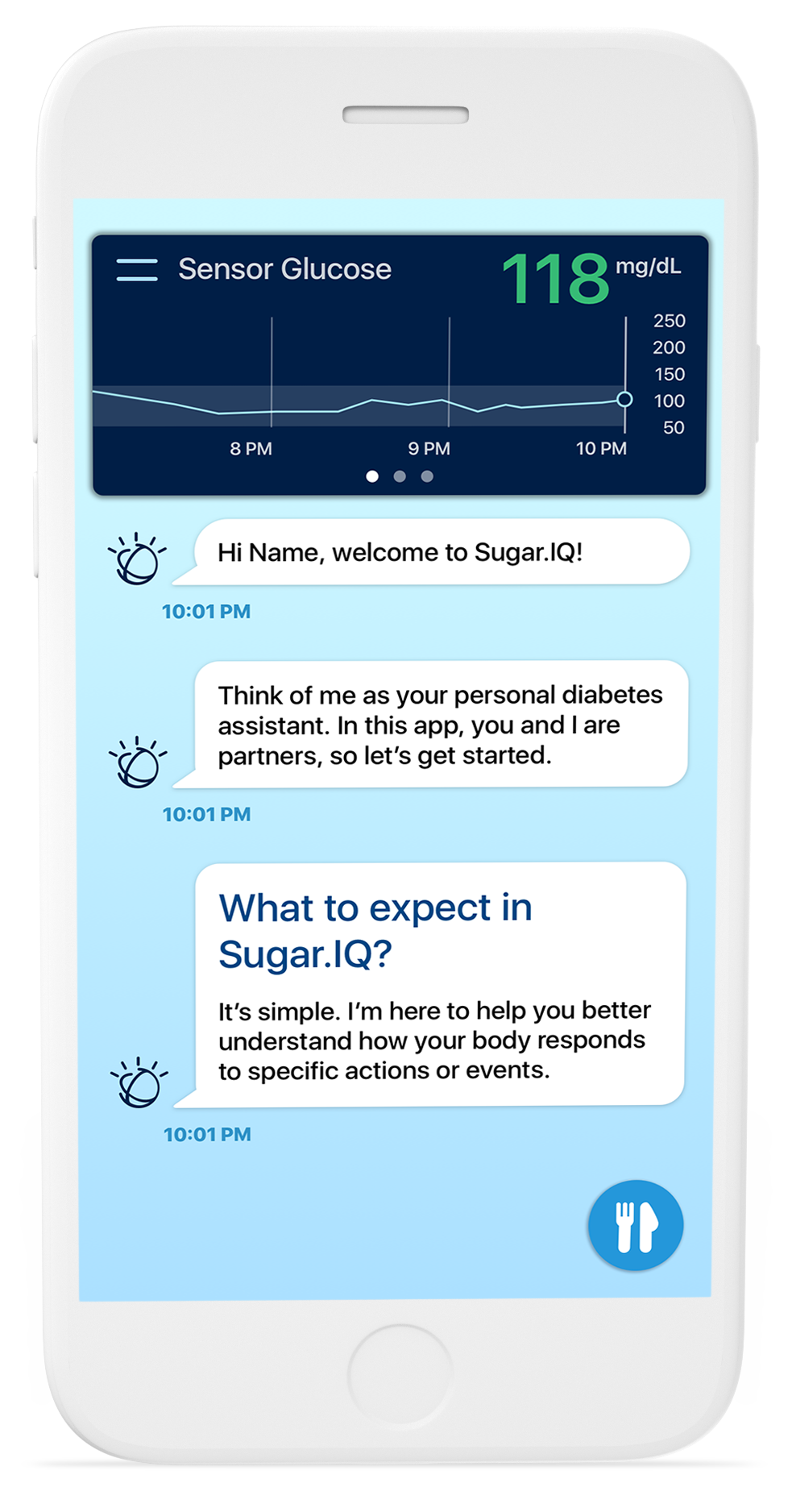
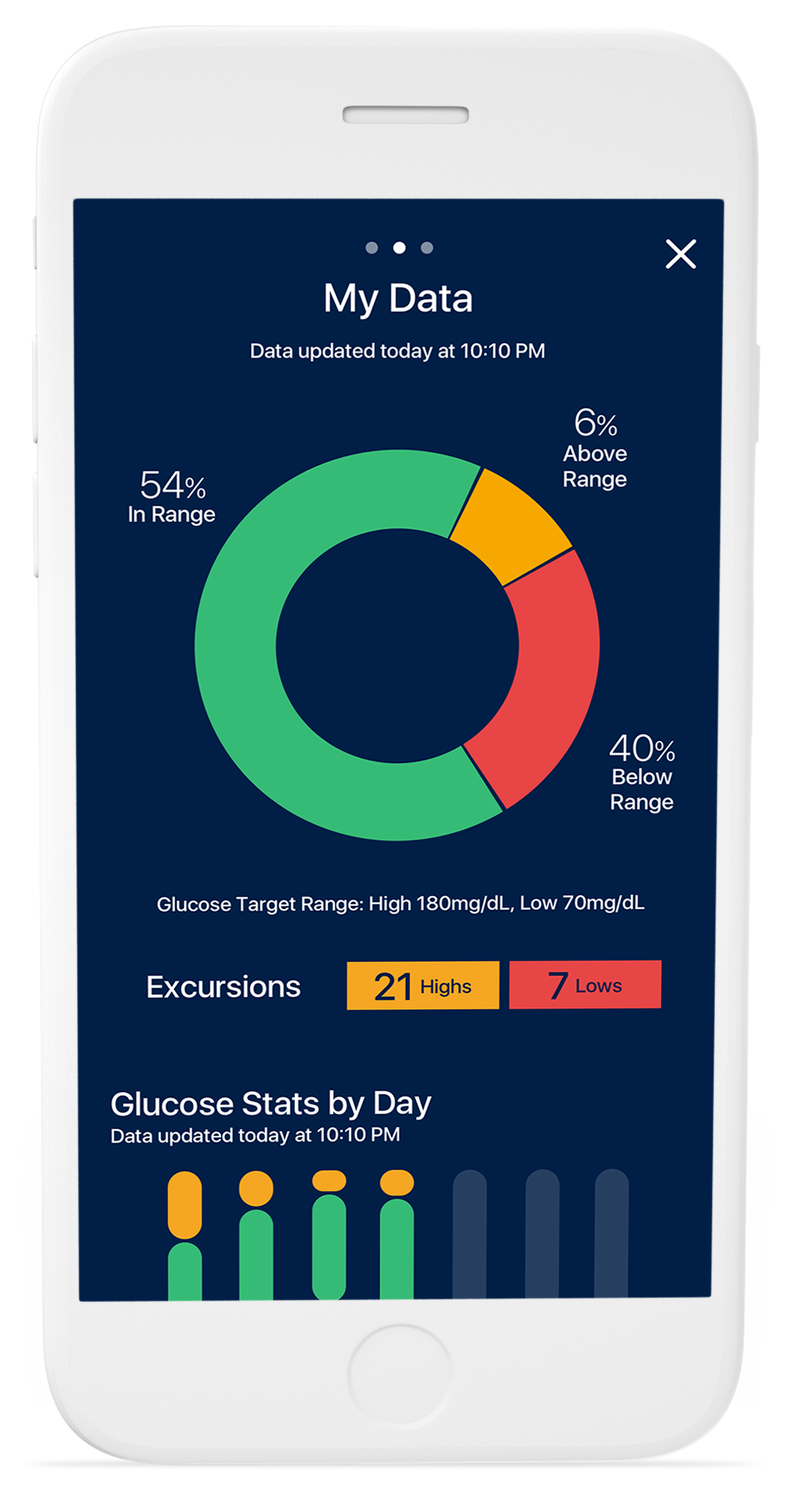
The Sugar.IQ diabetes assistant is a first-of-its-kind cognitive app that helps detect important patterns & trends for people with diabetes. This app uses IBM Watson analytics to continually analyze how an individual’s glucose level responds to food intake, insulin dosages, & daily routines; and in turn, offer real-time, personalized insights so people can easily understand their glucose in context to their lifestyle choices.
While I was involved with the UX & UI design of the first iteration of Sugar.IQ, the following Case Study will focus on the app’s user onboarding process, where I was the sole designer responsible for its design, animation and testing.
IBM iX — 2016
Role: UX/UI Designer; Onboarding Prototyper
Client: Medtronic
UX Design Team:
Artour Parmakian, Creative Director
Kyle Thiboutot, UI Designer
Nina Greel, UI Designer
*Due to the confidentiality of this project, only certain information can be shared. Click here for more information.
Because 25% of users who download an app only use it once, it’s important to design an engaging onboarding process that encourages them to return. That means first impressions are kinda a big deal.
CRAFTING ONBOARDING DESIGN TENETS
I started my design approach by crafting user onboarding design tenets to utilize as my North Star.
Use Less Text
Avoid relying only on text because it kills pacing, destroys immersion, and will often be skipped by the users who need the tutorial the most.
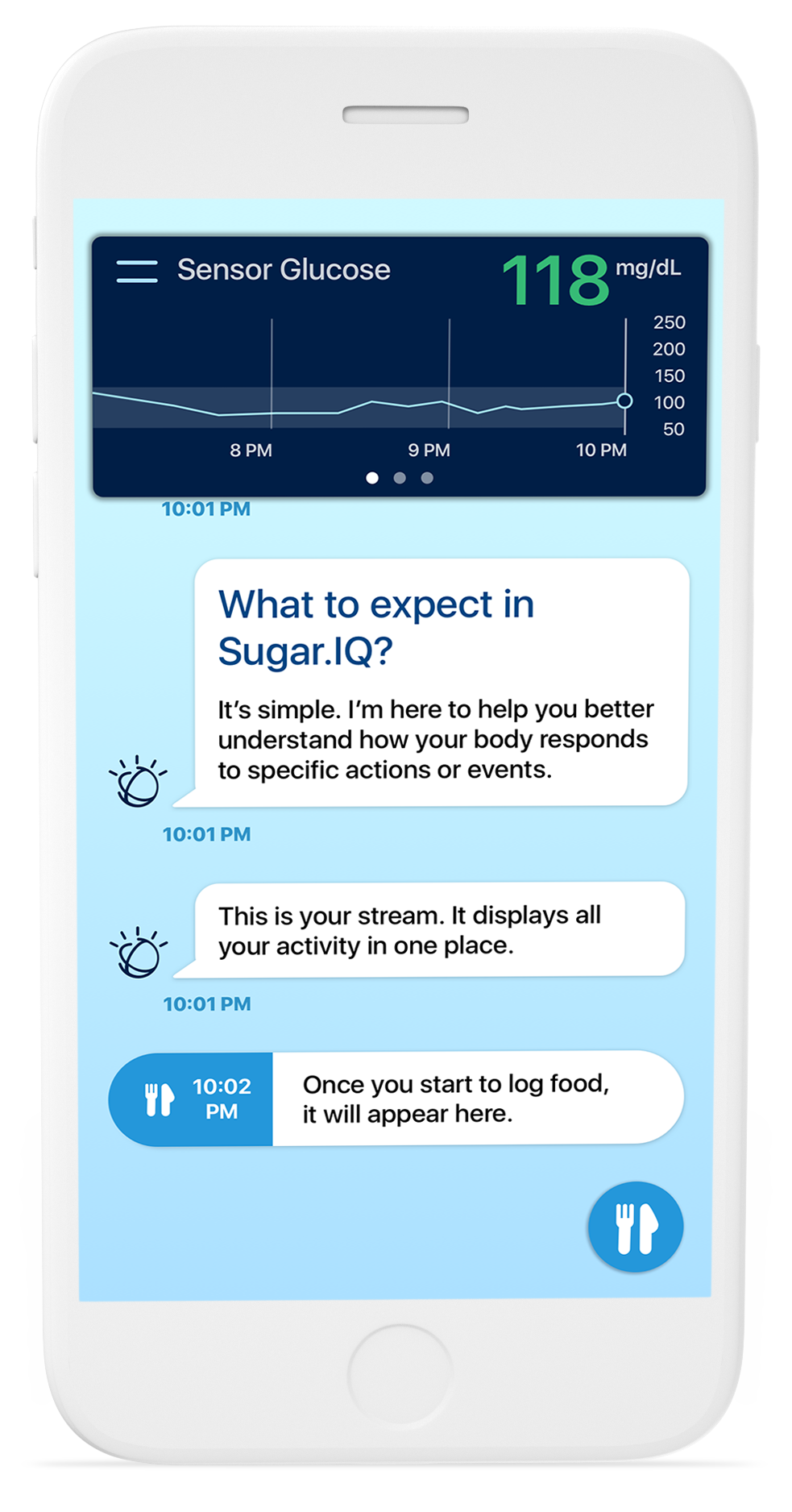
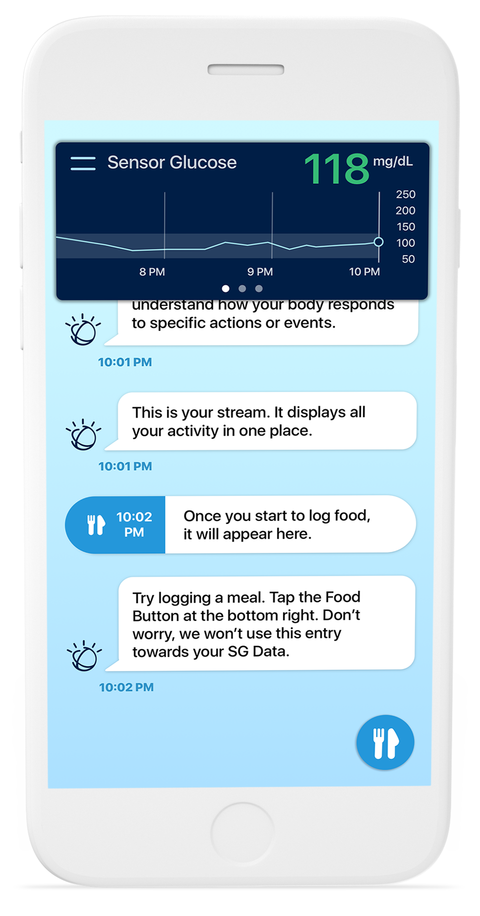
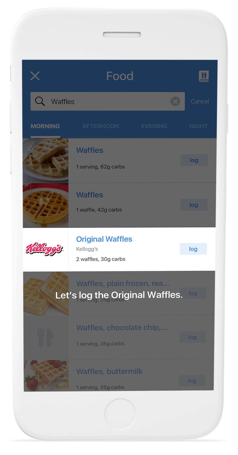
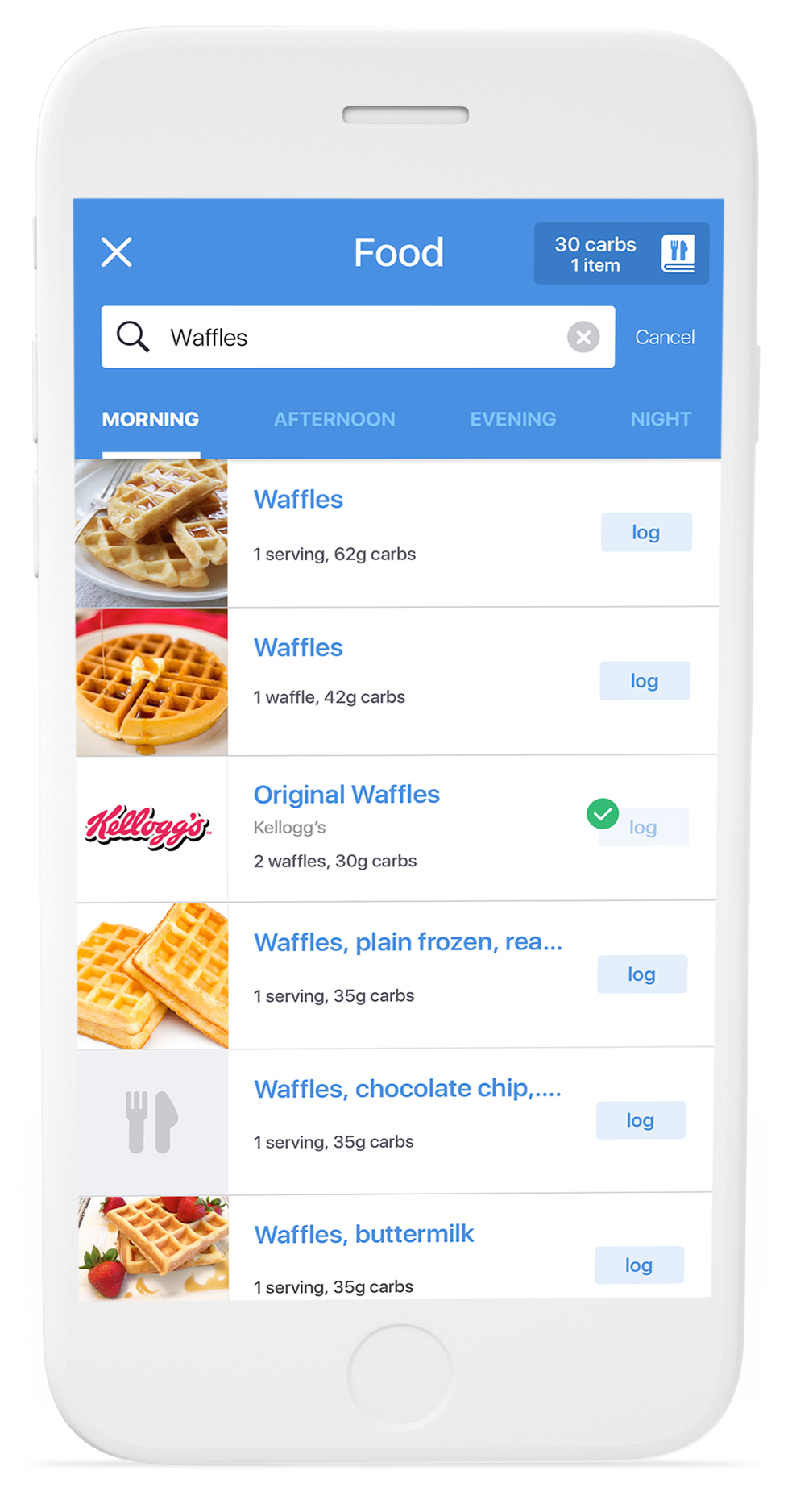
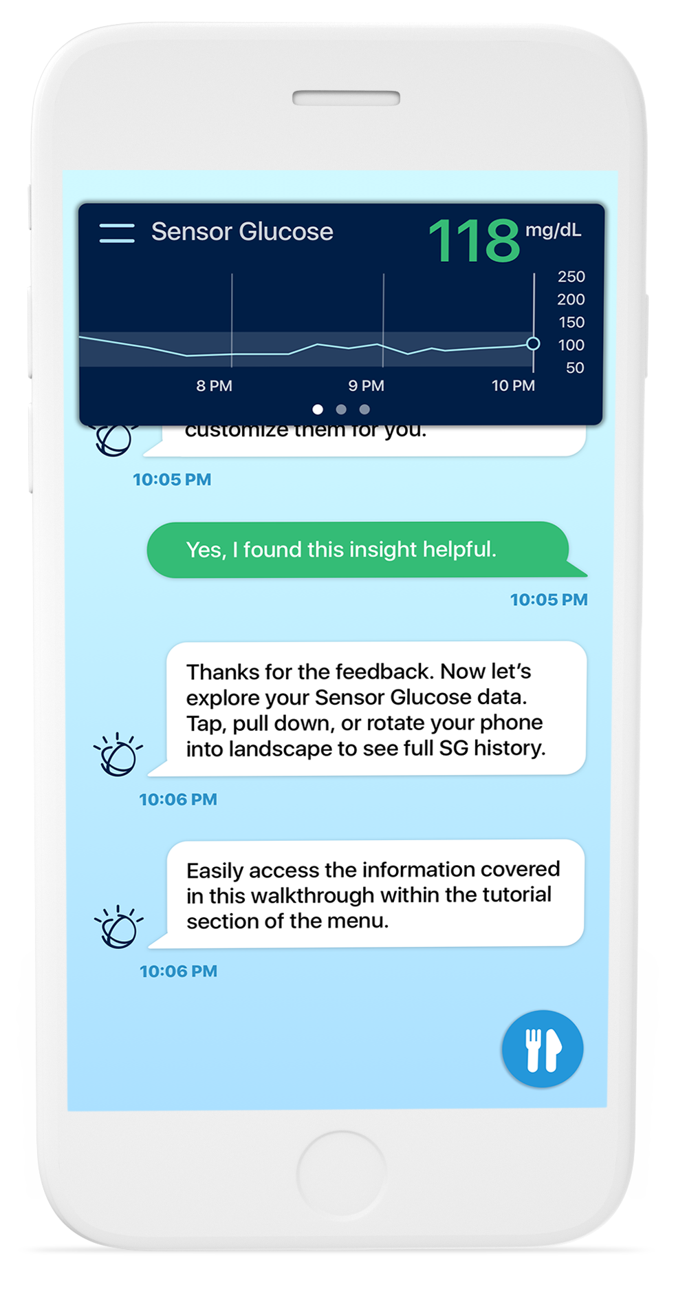
Learn by Doing
Teach users how to use the app by letting them use the app. 🤯 Know which core features you want users to be fluent in and focus 100% of your energy on hammering those learnings home.
Don’t Frontload
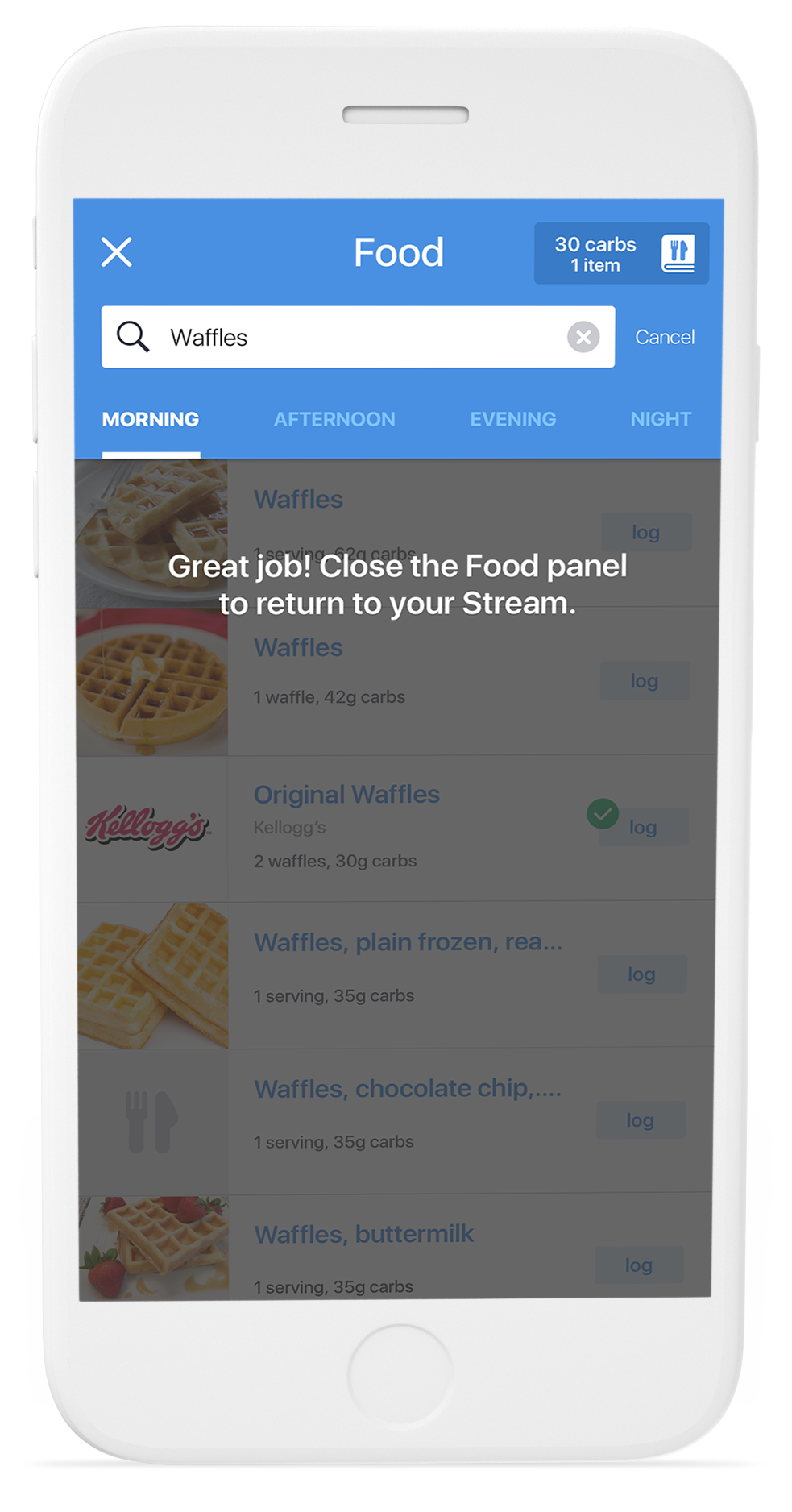
Don’t overwhelm users with too much information all at once. Instead, provide the info in short, easily digestible chunks, precisely when they need it.
Make it Fun
Instill a sense of playfulness by simply accompanying an action demonstrated in a tutorial with a very subtle bit of visual or tone-based feedback.
DETERMINING THE RIGHT STYLE
After establishing my North Star, I needed to determine which onboarding style to utilize. Because of certain complexities within the app, I was worried some users would abandon the app if instruction wasn’t provided, so a simple swipe through tutorial was out.
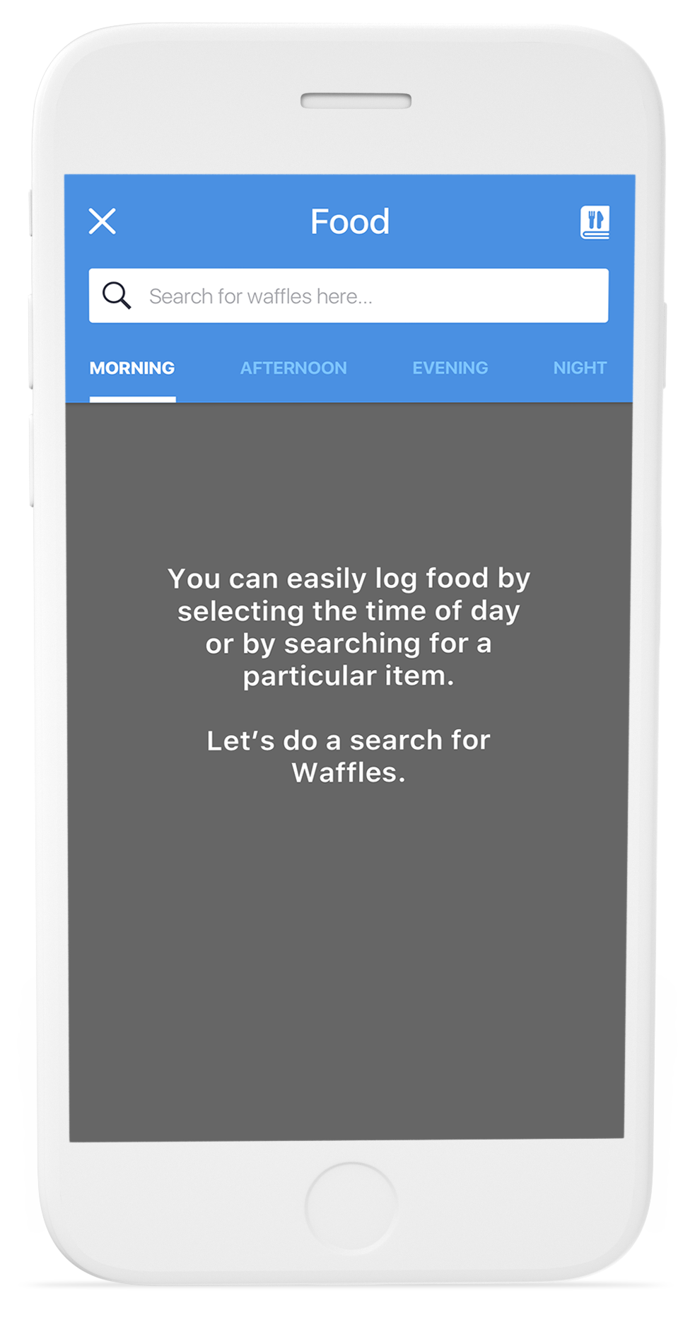
I quickly determined that a product tour paired with a learn-by-doing demo would shorten the new users’ time to value, guide them to their aha moment, and motivate them to use the app again.
The product tour would highlight key features of the app while the learn-by-doing demo would require users to complete tasks that teach them how to use those key features within a controlled environment.
IDENTIFYING WHICH FEATURES TO SHOWCASE
Narrowing down which of your product’s features to highlight in a product tour is no easy task. This required revisiting the prioritization of features, reviewing user research, and partnering with key stakeholders.
I wanted to ensure the onboarding flow held true to the design tenets, which meant I needed to map out 3-5 features at most.
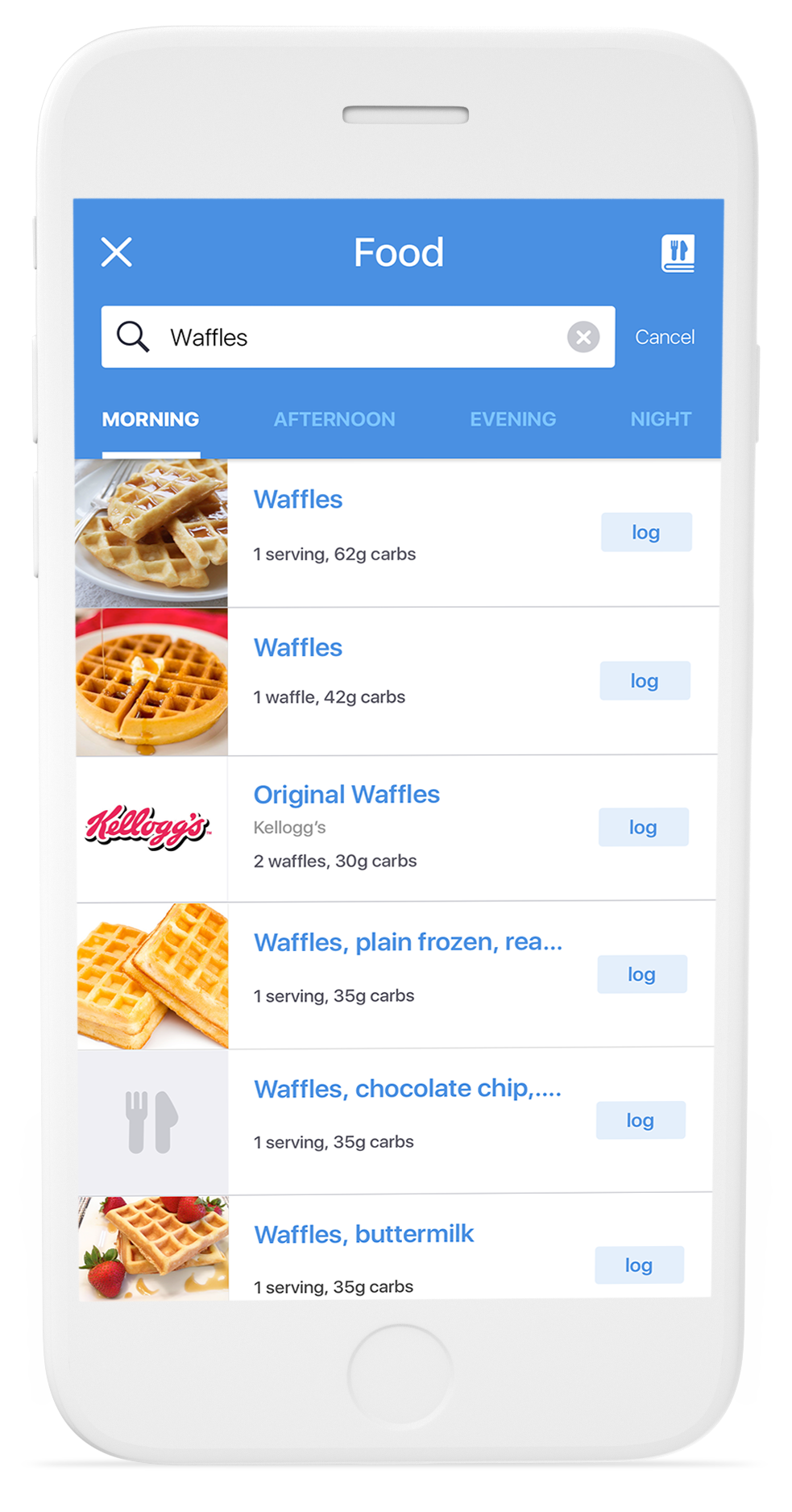
IMPLEMENTING SPECIFIC UI PATTERNS
Still not set on the best onboarding flow, I decided to mock up potential designs & test them out with users in order to land on the one with the highest impact.
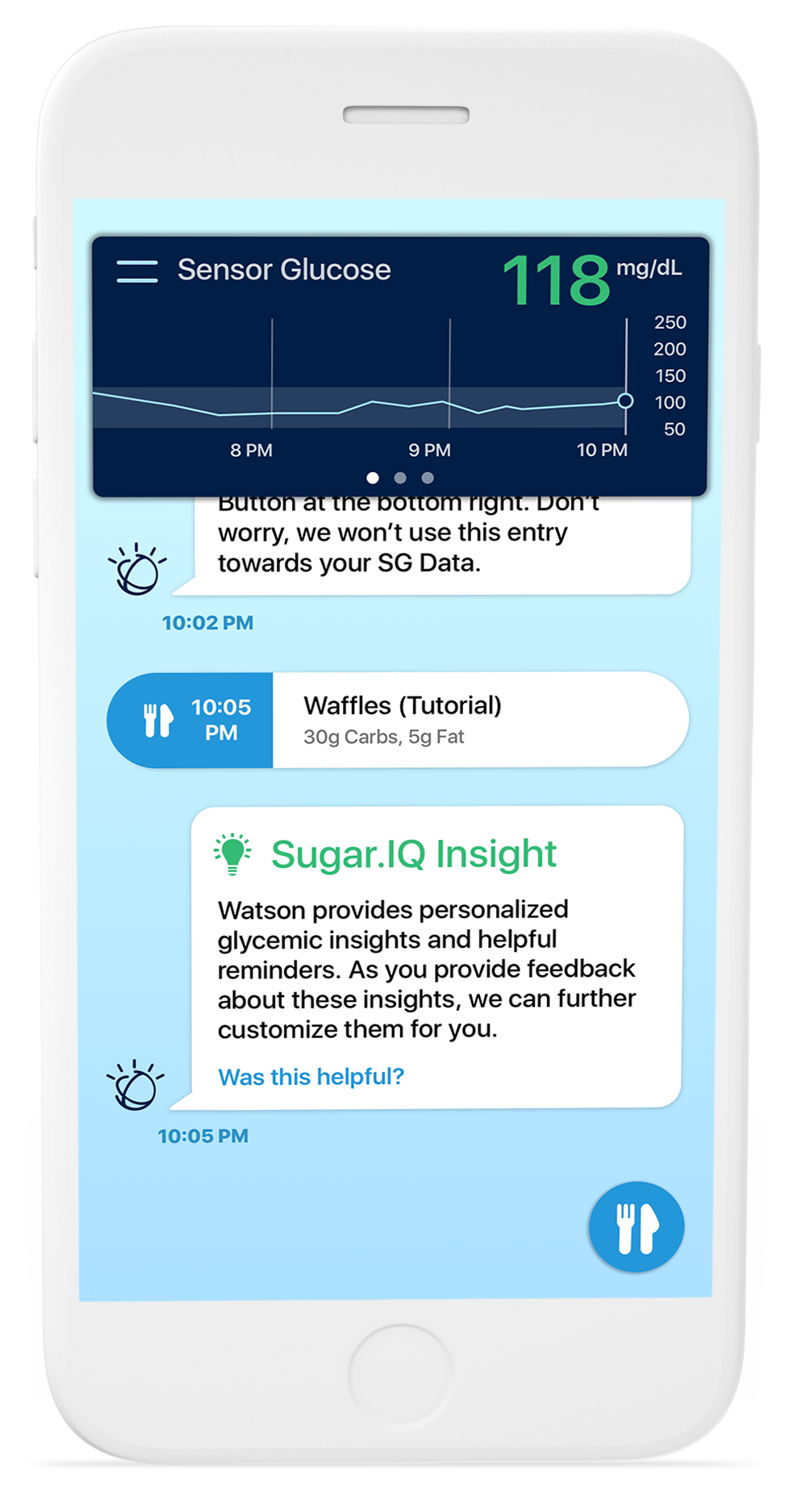
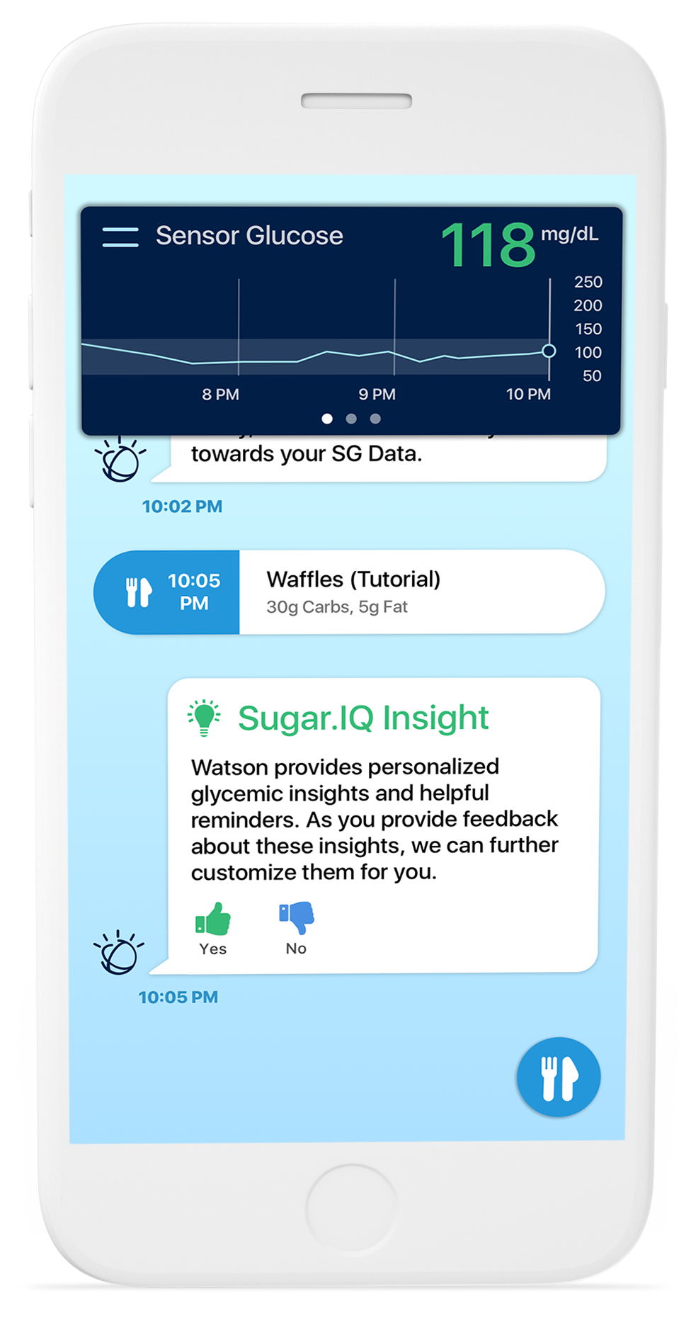
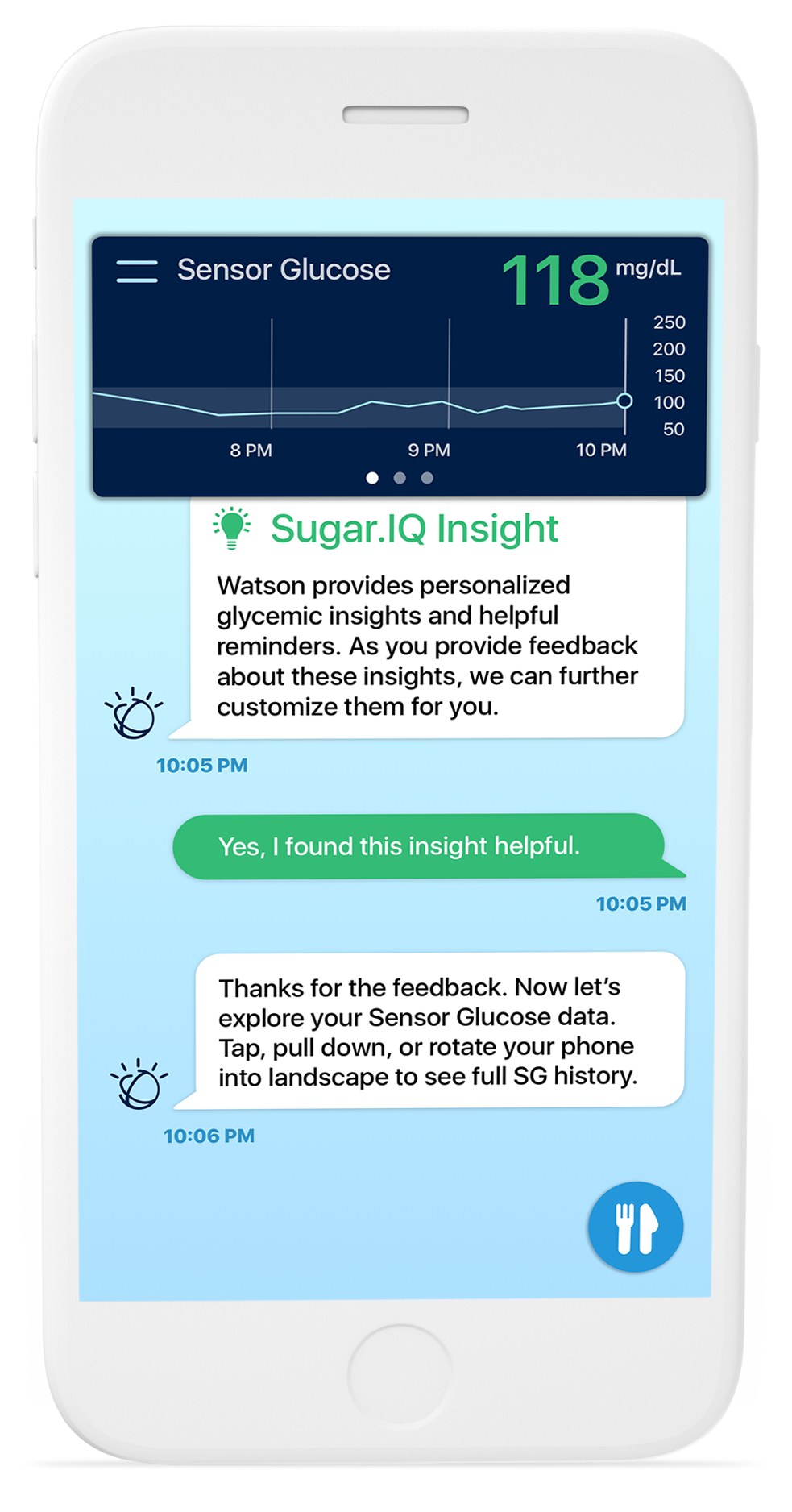
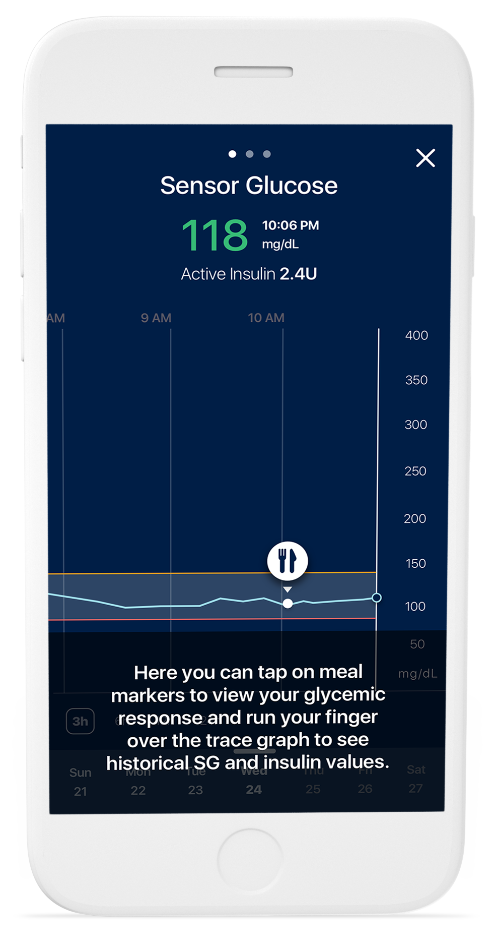
THE SOLUTION*
After a few iterations & rounds of usability testing, the result was a minimal, contextual onboarding experience that helped users familiarize themselves with the interface & get up to speed as swiftly as possible. Hotspots helped to draw the eye, while brief tooltips explained the value of each feature.